
Interactive Dashboards
Dashboards are a useful way of displaying crucial information in an easy to access format.
Whilst dashboards are traditionally thought of as a business tool, they are used in everyday life to display information that we need to know.
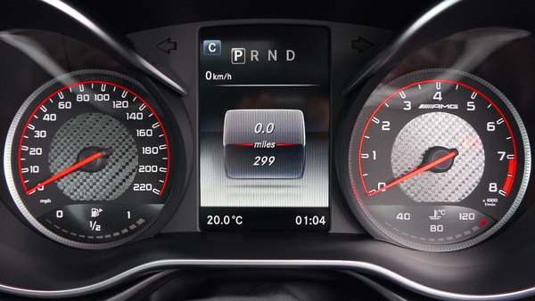
Examples of dashboards are in transport vehicles. Cars, boats and aeroplanes all display highly critical information in view of the driver, skipper or pilot.
Think of a car dashboard. A car dashboard can display a significant amount of information including:
- Speed - So you can vary it according to the speed limit;
- Fuel level - To the extent that it may flash a light, prompting you to fuel up when running low; and
- Maps - Directing you to your destination.
Whilst the car’s dashboard has a significant amount of information, what is most important to the driver (speed, fuel etc.) is prominently displayed in terms of location and size.
Why use a dashboard in your business?
Dashboards are critical to understanding your business. They can identify where your business is going well and where improvements need to be made.
Dashboards remind you of what is going on, using your data to tell you if there are any issues, and prompting you when action is required.
Data Analysis Australia Dashboards
To demonstrate the information and insights that can be produced, Data Analysis Australia has created a dashboard for a fictional ice cream company, Jen and Terry’s operating in New South Wales, Victoria and Western Australia.
In an attempt to increase revenue and market share, Jen and Terry’s, have introduced some new flavours in different states to differentiate themselves from competitors. Jen and Terry’s wants to understand the impact these new flavours are having on their key KPI’s (revenue and customer satisfaction) and how the business is performing overall.
Our dashboard for Jen and Terry’s have been created using the coding software R[1]. R is open source software, available to be downloaded by anyone, meaning that no set up or ongoing licensing fees need to be paid. Our dashboards are updated in real time (with minimal maintenance required), allowing management to be constantly aware what is happening in the business at all times.
To understand how the business is performing, it is imperative that the information displayed is valuable and can provide insights, an area that our team Data Analysis Australia is highly experienced in.
We now discuss Jen and Terry’s dashboard to take you through the insights journey, at the same time as demonstrating some of the key points and functionality of our dashboards.
Front Page – Executive Summary Tab
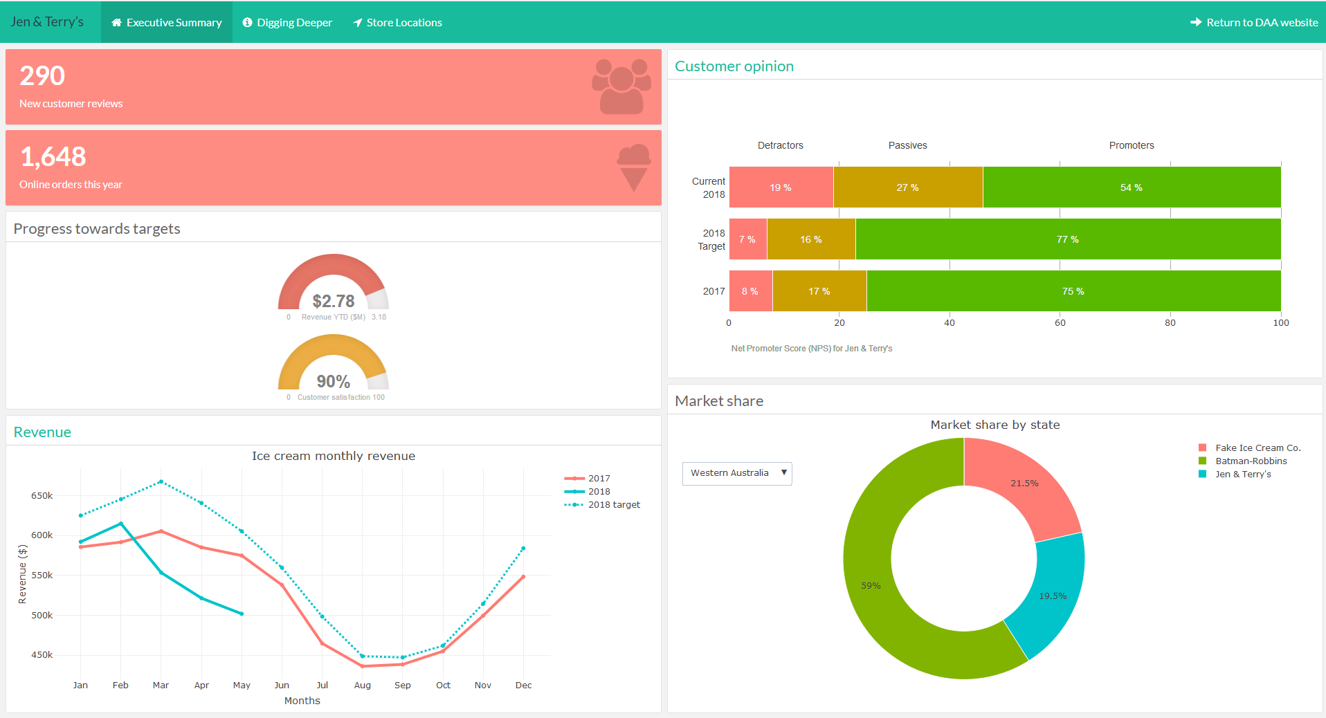
The front page of a dashboard needs to clearly display the key information succinctly and identify immediately if there is a problem. Through the dashboard homepage for Jen and Terry’s, it can be seen:
Revenue
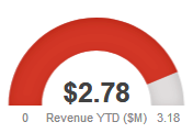
Revenue is below target – Actual revenue equals $2.78M, against a target of 3.18M. The speedometer is coloured red to easily identify that the target is not being met and some action of further investigation needs to be taken.
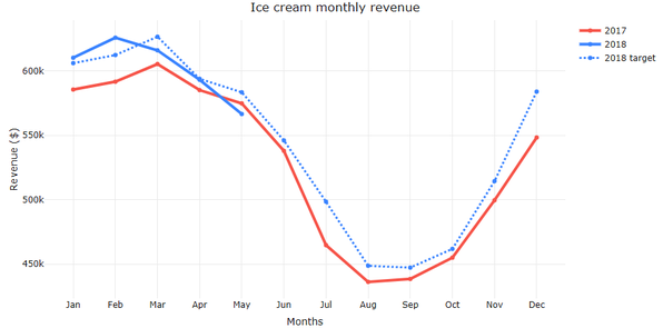
Ice cream revenue is seasonal - There are more sales in summer and fewer sales in winter. Revenue in May 2018 (the current month) is lower than 2017 revenue and the target revenue for 2018. This should be looked at further to identify if this is a one off or something that needs to be addressed.
Customer Satisfaction
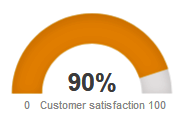
Customer satisfaction is reasonable but should be monitored - Whilst it is not hitting target, customer satisfaction is only slightly below target (indicated by the speedometer being orange). The drop in customer satisfaction may be related to the drop in revenue.
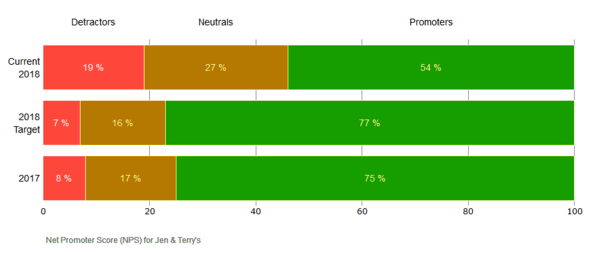
More customers dislike Jen and Terry’s in 2018 – Customer satisfaction has dropped in 2018 with more detractors and fewer promoters compared to both 2017 actuals and the 2018 target.
Market Share
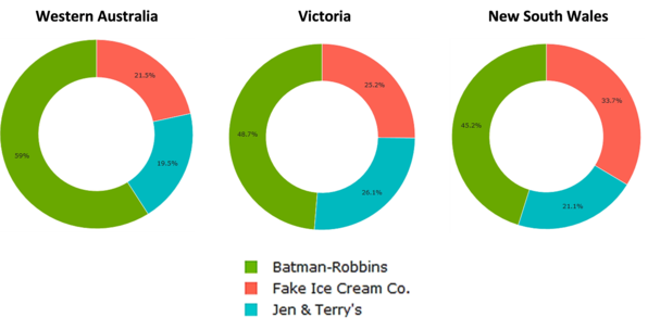
Market Share in Western Australia is lower than in other states - Jen and Terry’s only has 19% market share in Western Australia, compared to 26% in Victoria and 21% in New South Wales.
Dashboards – More Detailed Tabs
Now that we have identified there is a problem (revenue being below target) from the Executive Summary tab, the next step is to find what is driving the problem.
The following pages of a dashboard allow us to dig deeper to identify the core of the problem.
Revenue – By State
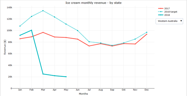
The below graphs show the revenue split by state.
Western Australia Revenue is well below target - Revenue targets are being achieved in both New South Wales and Victoria. The poor overall revenue is being driven by revenue in Western Australia.
Customer Satisfaction – Split by State and Flavour
In the executive summary section, it was noted that customer satisfaction was slightly below target. Now that it has been identified that the issue with revenue is all related to the Western Australian branch of the business, we can look at the Net Promoter Scores of Western Australia to see if there are any issues from a customer satisfaction point of view.
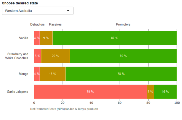
Garlic Jalapeno is strongly disliked by customers in Western Australia - From the customer satisfaction graphs (per ice cream flavour), a clear issue can be seen. The Garlic Jalapeno (only available in Western Australia), has a 79% dissatisfaction rating, much higher than any other flavour.
The dashboards have allowed us to easily derive insights about our customers in terms of what is potentially impacting revenue and what products are resonating and not resonating with them.
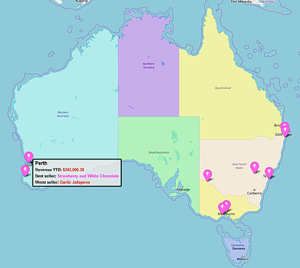
Mapping
A key feature that has been included in the dashboard is the ability to visualise key insights by location in the form of spatial analysis or mapping. As seen below, we can hover over a location (where our fictional stores are located) to extract key information about each location.
As per the below map, Perth has revenue of $242K, well below the target of $268K with the top selling flavour being Strawberry and White Chocolate, and the worst seller being Garlic Jalapeno. This confirms what we saw in the “Digging Deeper” tab - that Garlic Jalapeno is unpopular with customers, likely impacting revenue.
Conclusion
Through the development of real time dashboards, we are able to identify an issue with Jen and Terry’s business (revenue is below target) and drill down to identify the root cause (the revenue issue is only in Western Australia and seems to be related to the introduction of a Garlic Jalapeno flavour). Now that the root cause is understood, Jen and Terry’s are able to put corrective actions in place.
The development of a dashboard similar to what we have shown does not need to be expensive and can have a significant return on investment for any business. The Data Analysis Australia team has extensive experience in developing dashboards using R, software openly accessible with no initial or ongoing licensing costs.
Our highly skilled team has the flexibility to set up a dashboard with whatever detail is required whether it be high level, detailed or the ability to do both.
June 2018
Footnotes
[1] R Core Team (2017). R: A language and environment for statistical computing. R Foundation for Statistical Computing, Vienna, Austria. URL https://www.R-project.org/.