
What Makes A Good Statistical Graphic?
Charts, diagrams and graphs have been used to present statistical data and results for centuries. The purpose is to present a finding or a summary of information in a manner where it can be readily understood. However, they also have a dark side, where graphics are used to present a particular view or a biased interpretation of the data. Hence, it is important to consider just what makes a "good" graphic.
Data is often presented in tables, but these have long been recognised as a particularly poor means of communication. In 1786 the English economist William Playfair wrote
Information, that is imperfectly acquired, is generally as imperfectly retained; and a man who has carefully investigated a printed table, finds, when done, that he has only a very faint and partial idea of what he has read; and like a figure imprinted on sand, is soon totally erased and defaced.
Playfair went on to present the political and economic data of his day in graphical form, particularly in his famous book The Commercial and Political Atlas. Today, when we are used to computer produced graphics, historical graphics look somewhat quaint but they remain examples of well designed tools of communication
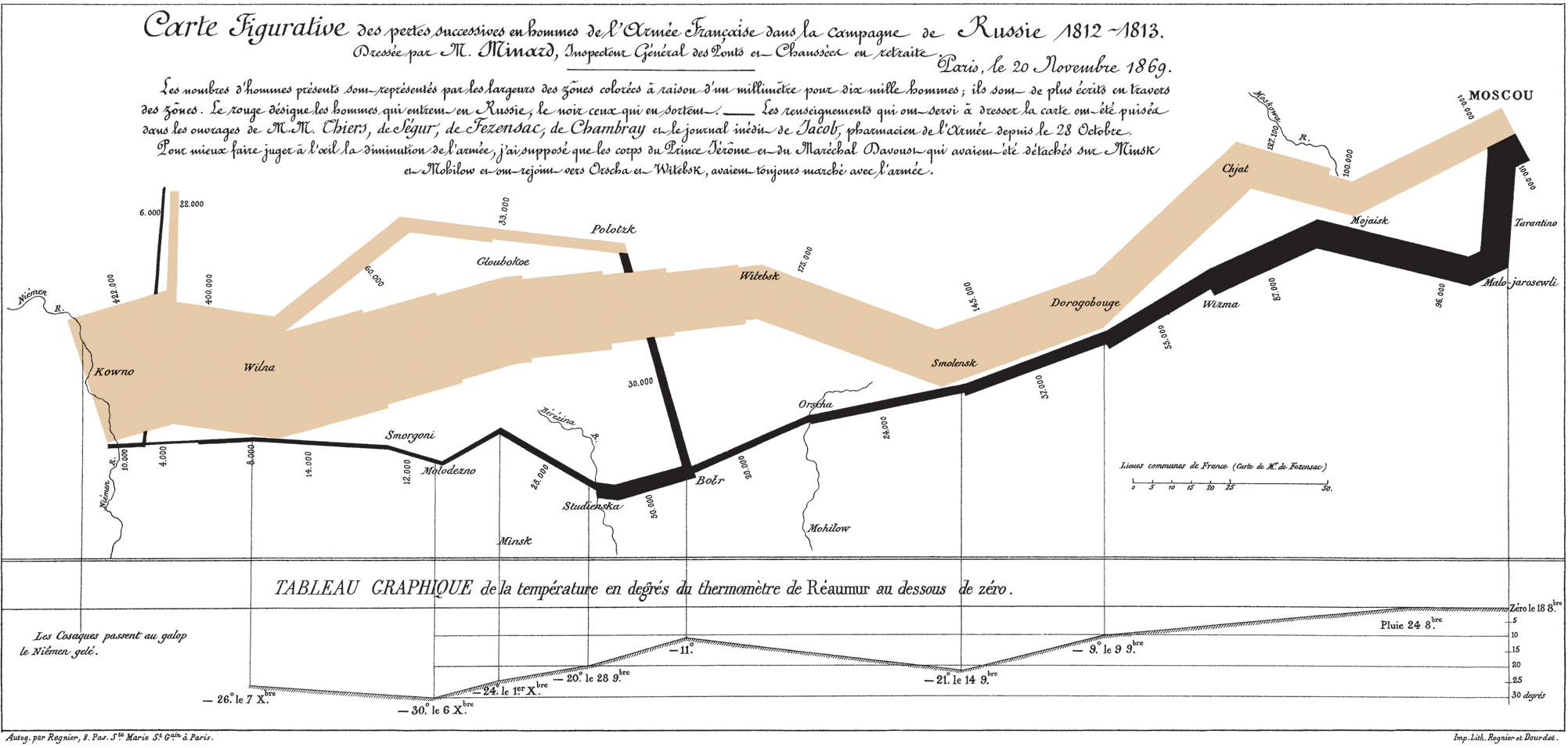
The connection between statistical graphics and maps has always been strong. Cartographers need to present geographical information in a clear, accessible manner and have learnt to do so in maps while keeping a fine aesthetic sense. The statisticians' favourite example is the map Charles Joseph Minard produced, which illustrated the disastrous Russian campaign of Napoleon. Here, the path taken by the Grande Armèe invading Russia in 1812 and then the retreat is shown, with the width of the line indicating the size of the army. The reduction of the initial army of 422,000 down to just 10,000 survivors (as presented in this version) is very apparent, as are some of the events along the way that decimated the forces. As an extra touch, Minard included a parallel graph showing the temperature during the retreat, the enemy of both sides but particularly the French.
This graphic demonstrates one of the continuing features of good statistical communication. It presents an immediate message in an engaging and satisfying way (the map showing the route to and from Moscow) while still having a good amount of detail and additional variables. It allows the reader to put some of the information together themselves to gain greater understanding - such as the halving of the army while crossing the Berezina River, an event still commemorated in French history.
Contrast this with the many hundreds of graphics that might look like:
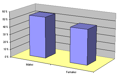
This apparently displays just two numbers, the percentages of males and females, but in reality this is only one independent number since they must add to 100%. And even this task is not done well since the use of an unnecessary third dimension means that it is hard to read the height of the bars against the scale. This waste is brought about by easy to use (but not always useful) software and an unthinking attitude that "any graphics must be good". Unfortunately this is not the worst example - modern software allows much more fancy patterns to help confuse the message.[1]
To many statisticians, the canonical texts on these matters are the books by Edward R. Tufte, starting with his famous The Visual Display of Quantitative Information. Tufte is a unique individual, a professor emeritus of political science, computer science and statistics, and graphic design at Yale. He presented a concept of the data to ink ratio of a graphic - how much ink used in the graphic is really necessary to display the information. Maximising this ratio in a sensitive way leads to both adding more data provided it does not confuse the message, while at the same time simplifying the graphic style. Some of Tufte's graphics finish up being very minimalist, bordering on Zen, but they do work.
For business, one of the catch phrases is being able to "drill down" into a company's data. With this principle applied to good graphics - they give the top line result, without compromising the clarity of that result they also give the next stage as well. Ideally they have the "why" behind what is happening. In this, a famous quote of Einstein is often paraphrased as "everything should be made as simple as possible, but not simpler". Graphics should be simple, but not so simple that they hide the truth.
A simple example below takes the male-female graphic, removes the unnecessary third dimension and adds age information as well. This relates to the scale far better, makes use of the area to represent the extra information (age in this case) and provides insight into the reasons for the differences between male and female numbers, indicating that the difference appears to be in just one age group.
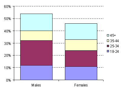
While some people might claim it is less exciting than the earlier graphic, most would recognise that it provides better communication. It is still not ideal. The software does not readily allow a representation of the information hierarchy by permitting the divisions within the columns to be given less emphasis, so the attention is drawn first to the male-female comparison and then the age categories. The colours, the software default, would not be many people's first choice.
These examples relate to presenting facts, data that represents exact measurements. Many statisticians need to represent data that naturally has some uncertainty about it. The results of a survey are really presented for what they say about the population and the exact data is only an approximation to this. Good graphics should communicate the uncertainty in a clear way. A classic way of doing this is to use error bars. This is particularly important in applications such as forecasts, where the absence of bounds can completely mislead the reader on the risks in using a forecast.
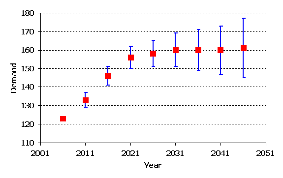
Error indicators can be added to some forms of graphic but not readily to others. For example, it is not clear how to add them to a pie chart, adding one more negative to perhaps the worst style of graphic used today.
All the graphics discussed so far are today done on computers, but are mostly simple enough that they could be done by hand. They are often seen as ways of summarising data, so a lot of detail is purposely omitted. Today a new style of graphic is becoming more common, one that attempts to display the raw data itself. This style really does require a computer for anything but the smallest data sets.
Graphing a whole data set aims to explore the data, giving an understanding of relationships, distributions and oddities that a summary or formal statistical analysis might miss. These graphics are the everyday tool of the modern statistician, and are commonly used when statisticians communicate with each other. However, this makes the graphics somewhat different from those used to communicate with non-statisticians, and hence the subject for a future Analytical Ideas.
April 2008
Footnotes
[1] An unfortunately good example of how overly complex graphics can detract from an important message is the book Women's Atlas of the World by Timothy Fast and Cathy C. Fast, Facts on File, 1995.