
Mapping - Providing Direction
Well-designed graphical illustrations are a vital ingredient for conveying a message in a report or presentation. They enhance understanding and bridge the gap between detailed analysis and meaningful interpretation.
One of the earliest graphical tools is geographic mapping. Archaeologists have found cave drawings in the Czech Republic dating back tens of thousands of years containing geographic representations of the landscape. Maps have been found from almost all civilisations through the ages, including the Babylonians, ancient Greeks, Romans and many Chinese dynasties including the Han Dynasty, inventors of the magnetic compass.
Why are maps so old compared to other graphical representations of data, like bar graphs which are only a few hundred years old? Maps provide a raw and fundamental connection to the space in which we live and move and relate – on a local scale up to a world-wide scale and beyond. They are grounded in physical, spatial reality. Maps are a unique way of communicating, describing and informing; they are one of the most meaningful illustrations available.
In the past it required months of painstaking observation, measurement, triangulation and calculation to produce a single map of a large area. Now there are so many utilities and data sets available that there’s a risk of producing a quick image with little thought. Often, aesthetics are put ahead of understanding and meaning.
However, Data Analysis Australia is different: we are adept at producing statistically supported insights and equipped with the software and skills to display such insights with maps and other graphics.
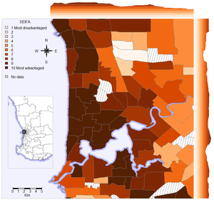
Sometimes the display of simple summaries of data, such as histograms and density plots, can be made more intuitive in combination with a map. The second image displays a Socio-Economic Index for each of the Australian Bureau of Statistics’ Statistical Areas (Level 2) for Perth. These measures use Census variables and can be used to identify areas in need of government support such as healthcare programs, and areas that businesses can utilise for new ventures, amongst other things. On the top and right borders of the map are graphs that display the population-weighted average index along the longitudes and latitudes, providing additional insights. These graphs illustrate that the most advantaged areas tend to be closer to the coast. However, there is less trend in the north-south direction. Both the map and the accompanying graphs are meaningful in isolation, but when combined, the information content is greater than the sum of its parts.
Our mapping capabilities complement our core statistical and analytical skills, allowing us to add value to data, results and interpretation by providing meaningful visual representations that combine map information and statistical summaries, customised to your requirements.
For further information on using maps to add insights to your data, please Contact Us.
September 2015