
Interactive Dashboards
Data Analysis Australia is experienced in translating findings into a form that is designed specifically for our clients' needs whether it is providing insights in a formal report, presentation or interactive tool. We are highly skilled at programming and are able to provide a tailored product to client's software and develop sophisticated graphics individualised for the purpose at hand. Examples of our capabilities include:
Interactive Dashboards for monitoring progress, allowing the user to dig deeper into issues;
Excel User Tools with a user friendly interface and complex analysis, modelling or forecasting in the background; and
Live online web application to monitor near real-time data and provide alerts and notifications to assist with critical decision making.
Interactive Dashboards
Why use a dashboard?
Dashboards are a useful way of displaying crucial information in an easy to access format. Whilst dashboards are traditionally thought of as a business tool, they are used in everyday life to display information that we need to know. Examples of dashboards are in transport vehicles. Cars, boats and aeroplanes all display highly critical information in view of the driver, skipper or pilot. Think of a car dashboard. A car dashboard can display a significant amount of information including:
Statistical Graphics
What makes a good statistical graphic?
Charts, diagrams and graphs have been used to present statistical data and results for centuries. The purpose is to present a finding or a summary of information in a manner where it can be readily understood. However, they also have a dark side, where graphics are used to present a particular view or a biased interpretation of the data. Hence, it is important to consider just what makes a "good" graphic. Data is often presented in tables, but these have long been recognised as a particularly poor means of communication. In 1786 the English economist William Playfair wrote
Related Case Studies
Alternative Water Sources
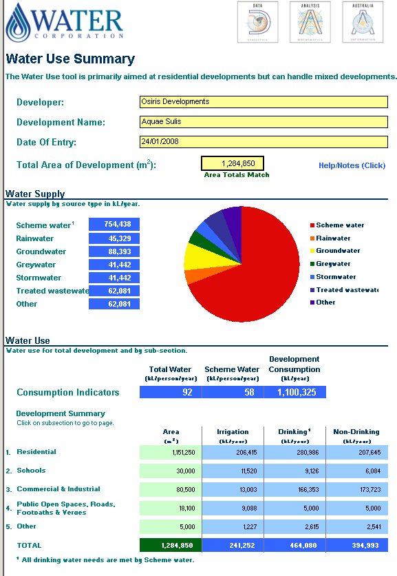
The Problem: How can alternative water sources help reduce the need for (potable) drinkable water in new developments?
The Data Analysis Australia Approach: To develop a tool to assist developers in profiling water use and to specify how some of this demand is to be met by alternative water sources.
The Result: A spreadsheet model with an easy to use interface that summarises water use and supply for a new development.
Statistical Data Science
Analyse, visualise, and model data using the latest statistical and data science techniques
Surveys
Develop, carry out and analyse surveys to understand perception and find business insights
Forecasting and Prediction
Discover trends and predict the future with data
Spatial Analysis and Mapping
Learn how data is spatially correlated to inform strategy
Business and Risk Analysis
Understand how risk and uncertainty can be minimised in business decisions
Big Data and Machine Learning
Uncover trends and relationships to gain valuable insights from big data
Simulation and Optimisation
Determine the optimal way to operate in the future
Mining Analytics
Improve processes and uncover new insights
Interactive Dashboards
Make informed decisions from real-time data with intuitive visuals and information